Understanding the Federal Budget
Chapter 3: Human Resources and Social Insurance
This eBook is available at Amazon.com for a $2.99 contribution to this website.
As we saw in Chapter 2, the largest increase in the federal budget over the past sixty years has been in the area of Human Resources. This category went from 33.4% of the budget and 5.1% of GDP in 1950 to 70.0% of the budget and 14.5% of GDP in 2013. The great bulk of the expenditures in this category fund our social-insurance programs. These are the programs—the largest of which are Social Security and Medicare—that grew out of Franklin D. Roosevelt’s New Deal.
Social Security and Medicare, as well as many other programs provided by the federal government, are insurance programs in that they provide protection against the possibility of becoming indigent as a result of a devastating loss that may or may not occur. Social Security, for example, provides insurance against the possibility of not being able to save enough to provide for one's retirement, the loss of one's savings as a result of poor investment choices, outliving one's savings, or the inability to earn a living as a result of becoming disabled or through the premature death of a working parent or spouse. Medicare provides insurance against the possibility of becoming uninsurable due to poor health in one's elder years and the inability to meet one's healthcare needs out of savings.
These are social-insurance programs in that they pool the risk across all or most members of society by including all or most members of society in the payment and benefit structure they offer. In addition, they provide the kind of insurance that cannot be provided by private insurance companies in that there exists no market mechanism by which these kinds of risk can be efficiently or effectively pooled within the economic system in the absence of government intervention. (Lindert Kleinbard)
Payments for Individuals
Most of the expenditures in the Human Resources category of the budget are included in the Office of Management and Budget’s Table 11.3—Outlays for Payments for Individuals. The expenditures in 2013 for each program in this table that had a budget in excess of $500 thousand are listed in Table 3.1 along with the percent of GDP and of the federal budget that each program represented in that year.[22]
Table 3.1: Federal Payments for Individuals, 2013.
Program (2013)
Billions of
DollarsPercent of
GDPPercent of
Budget$1,008.5
6.07%
29.19%
$814.5
4.90%
23.58%
$667.2
4.01%
19.31%
$140.1
0.84%
4.06%
$7.2
0.04%
0.21%
$194.0
1.17%
5.62%
$54.3
0.33%
1.57%
$77.2
0.46%
2.23%
$59.4
0.36%
1.72%
$3.2
0.02%
0.09%
$68.3
0.41%
1.98%
$929.0
5.59%
26.89%
$273.0
1.64%
7.90%
$310.8
1.87%
9.00%
$9.5
0.06%
0.27%
$265.4
1.60%
7.68%
$4.3
0.03%
0.12%
$43.6
0.26%
1.26%
$7.3
0.04%
0.21%
$3.2
0.02%
0.09%
$8.2
0.05%
0.24%
$0.7
0.00%
0.02%
$2.1
0.01%
0.06%
$0.1
0.00%
0.00%
$0.8
0.00%
0.02%
$58.0
0.35%
1.68%
$13.2
0.08%
0.38%
$44.9
0.27%
1.30%
$39.3
0.24%
1.14%
$109.6
0.66%
3.17%
$82.5
0.50%
2.39%
$19.3
0.12%
0.56%
$6.6
0.04%
0.19%
$1.1
0.01%
0.03%
$172.5
1.04%
4.99%
$50.3
0.30%
1.46%
$21.2
0.13%
0.61%
$3.5
0.02%
0.10%
$57.5
0.35%
1.66%
$5.0
0.03%
0.15%
$5.2
0.03%
0.15%
$6.8
0.04%
0.20%
$21.6
0.13%
0.63%
$0.2
0.00%
0.00%
$1.2
0.01%
0.04%
$6.1
0.04%
0.18%
$0.4
0.00%
0.01%
$1.2
0.01%
0.04%
$1.4
0.01%
0.04%
$1.2
0.01%
0.04%
$1.8
0.01%
0.05%
$2,391.3
14.39%
69.22%
Source: Office of Management and Budget (10.1 11.3)
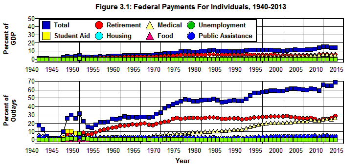
The totals for each of the major categories in this table are plotted in Figure 3.1 for the years 1940 through 2013, both as a percent of GDP and as a percent of the federal budget. In this figure, Total is Total, payments for individuals from OMB's Table 11.3; Retirement is the sum of Social Security and railroad retirement and Federal employees retirement and insurance; Unemployment is Unemployment Assistance; Medical is Medical care; Student Aid is Assistance to students; Housing is Housing assistance; Food is Food and nutrition assistance; Public Assistance is Public assistance and related programs; and Other is the sum of all federal payments for individuals in OMB's Table 11.3 not included elsewhere.
Source: Office of Management and Budget. (11.3 3.2 10.1)
Figure 3.1 shows the extent to which Human Resources has been dominated by federal healthcare and retirement programs. Retirement and Medical in Figure 3.1 went from 5.5% of the budget and 0.53% of GDP in 1940 to 29.2% of the budget and 6.1% of GDP in 2013. At the same time, Public Assistance, Food, Unemployment, Housing, Student Aid, and Other each remained at less than 6% of the budget during the entire period and none exceeded 2% of GDP.
Not only does Figure 3.1 show the extent to which Human Resources has been dominated by federal healthcare and retirement programs, it also shows that rising healthcare cost is the main engine by which Human Resources expenditures have been driven up since the 1960s. While there was a significant increase in the cost of federal Retirement programs since 1965 (by 9.9% of the budget and 2.9% of GDP) and the cost of federal Public Assistance programs has increased somewhat since then (by 1.1% of the budget and 0.4% of GDP), the cost of federal healthcare programs has increased by 25.4% of the budget and 5.3% of GDP since 1965.
When we examine the data in Figure 3.1 we find that 55% of the increase in the total costs of the programs listed in Table 3.1 since 1965 can be attributed to the increase in the cost of federal Medical programs, 29% to the increase in the cost of federal Retirement programs, and only 16% to the increases in the cost of all other programs listed in Table 3.1 combined.
The fundamental nature of this increase can be seen by examining the costs of the individual programs contained in each of the categories plotted in Figure 3.1.
Federal healthcare Programs
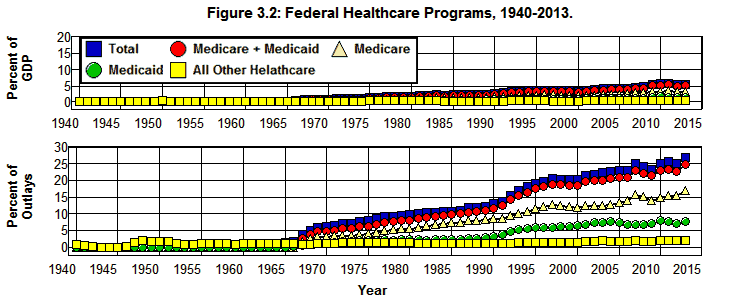
Medical in Figure 3.1 is the sum of the twelve items that fall under the heading Medical care in Table 3.1. The contribution of each program to the total healthcare cost of the federal government is displayed in Figure 3.2 by combining Medicare’s hospital insurance and supplementary medical insurance programs in Table 3.1 into the single variable Medicare and comparing the total cost of Medicare and Medicaid (Medicare+Medicaid) to the cost of these programs separately. The total costs of all other federal healthcare programs are combined in Other. These aggregates are plotted in Figure 3.2 along with the Total of Medical care in OMB's Table 11.3.
Source: Office of Management and Budget. (11.3 3.2 10.1)
It should be clear from Figure 3.2 that the fundamental problem with rising healthcare costs in the federal budget lies in the Medicare and Medicaid programs. While all other federal healthcare programs barely changed from 1965 through 2013—going from 1.28% of the budget to 2.31% and from 0.21% of GDP to 0.48%—Medicare went from a nonexistent program to 16.9% of the budget and 3.5% of GDP while Medicaid, which was virtually nonexistent in 1965, went from 0.23% of the budget and 0.04% of GDP to 7.7% of the budget in 2013 and 1.6% of GDP. Together, Medicare and Medicaid made up 24.6% of the budget and 5.11% of GDP in 2013.
Federal Retirement and Disability
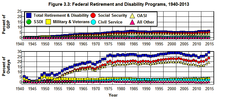
Retirement in Figure 3.1 is the sum of seven items in the OMB's Table 11.3. These items are displayed in Figure 3.3 by combining Social security: old age and survivors insurance (OASI in Figure 3.3) and Social security: disability insurance (SSDI in Figure 3.3) programs in the single variable Social Security and comparing this aggregate (which is often referred to by the acronym OASDI) with the Military retirement and Veterans service-connected compensation programs (which are combined in the single variable Military & Veterans in Figure 3.3) and the Civil service retirement and disability program (Civil Service) from the OMB's Table 11.3. Railroad retirement (excl. social security) is combined with Other (All Other in Figure 3.1).
Source: Office of Management and Budget. (11.3 3.2 10.1)
It is clear from Figure 3.3 that the Railroad retirement (excl. social security) and Other retirement programs in OMB's Table 11.3 play an insignificant role in either the budget or the economy as All Other amounted to only 0.30% of the budget in 2013 and 0.06% of the economy. The Military & Veterans and Civil Service retirement programs, on the other hand, play a somewhat more significant role at 3.3% and 2.2% of the budget and 0.68% and 0.46% of the economy, respectively, in 2013.[23] The major player in this segment of the budget is clearly Social Security which went from virtual nonexistence in 1940 to 23.4% of the budget in 2013 and 4.9% of the economy.
It is worth emphasizing, however, that even though there was a rather dramatic increase in Social Security from 1940 until it peaked at 4.8% of GDP in 1983, Social Security has been fairly stable relative to GDP since the 1970s. At the same time it must be noted that OASDI is expected to increase relative to the economy as the baby boomers retire, reaching a peak of 6% of GDP in 2036. This is 1.2% of GDP above its 4.8% peak in 1983. This poses a problem, but this problem is relatively minor and fundamentally different from the problem posed by the rising cost of healthcare in the federal budget.
Food and Nutrition
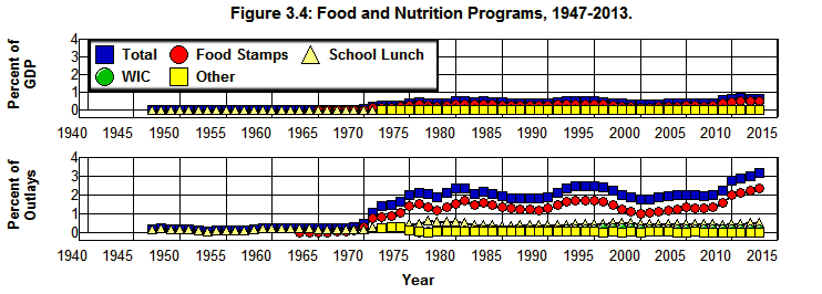
Food in Figure 3.1 is the sum of four items that fall under the heading Food and nutrition assistance in OMB's Table 11.3. Federal expenditures on each of these programs along with their total are plotted in Figure 3.4 from 1940 through 2013 where School Lunch is Child nutrition and special milk programs in OMB's Table 11.3, WIC is Supplemental feeding programs (WIC and CSFP), Food Stamps is SNAP (formerly Food stamps) (including Puerto Rico), and Other is Commodity donations and other.
Source: Office of Management and Budget. (11.3 3.2 10.1)
As is indicated in Figure 3.4, while expenditures on Food and nutrition assistance (Total) didn't even exist in OMB's Table 11.3 prior to 1947, this category of the federal budget increased dramatically during the 1973-1975 recession—increasing from 0.49% of the budget in 1970 and 0.09% of the economy to 2.14% of the budget and 0.44% of the economy by 1976—and has remained fairly high ever since. Expenditures in this category peaked at 2.47% of the budget and 0.49% of the economy in 1995 then declined to 1.81% of the budget and 0.32% of the economy by 2000. They then increased gradually until the crisis hit in 2008. By 2013 expenditures on federal food programs had reached an all time high—3.2% of the federal budget and 0.66% of the economy.
The largest of the federal food programs is the SNAP (formerly Food stamps) (including Puerto Rico) program (Food Stamps) which went from virtually nothing in 1965 (0.03% of the budget, 0.00% of GDP) to 2.39% of the budget and 0.50% of GDP in 2013. At the same time, Child nutrition and special milk programs (School Lunch) went from 0.22% of the budget and 0.04% of GDP to 0.56% of the budget and 0.12% of GDP by 2013; the Supplemental feeding programs (WIC and CSFP) (WIC) which didn’t come into being until 1976 increased to 0.19% of the budget and 0.04% of GDP by 2013, and Commodity donations and other (Other) began at 0.26% of the budget in 1972 and 0.05% of GDP and fell to 0.03% of the budget and 0.01% of GDP by 2013.
Just the same, this category takes up less than 4% of the federal budget today in spite of the employment problems caused by the financial crisis and economic downturn we have been attempting to deal with since 2007. The seemingly dramatic 2.9 and 0.62 percentage point increases (of the budget and GDP) in Total food and nutrition from 1965 through 2013 shown in Figure 3.4 are substantially less than the corresponding 16.9 and 3.5 percentage point increases in Medicare, the 8.9 and the 2.5 percentage point increases in Social Security, and the 7.5 and 1.6 percentage point increases in Medicaid shown in Figure 3.2 and Figure 3.3.
Public Assistance
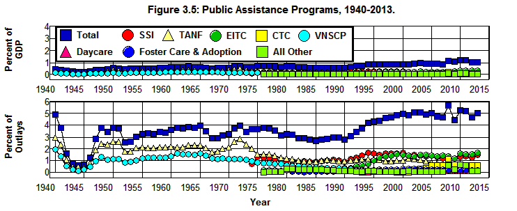
Public Assistance in Figure 3.1 is the sum of eight items in the OMB's Table 11.3. These items, along with the Total of Public assistance and related programs are plotted in Figure 3.5 where SSI is the Supplemental security income program in OMB's Table 11.3, TANF is Family support payments to States and TANF, EITC is Earned income tax credit, CTC (Child Tax Credit) is Payment where child credit exceeds tax liability, Daycare is Payments to States for daycare assistance, Foster Care is Payments to states—Foster Care/Adoption Assist, and VNSCP is Veterans non-service connected pensions. Expenditures on the Low income home energy assistance program and on Other public assistance in Table 3.1 are included in Other in Figure 3.4.
Source: Office of Management and Budget. (11.3 3.2 10.1)
There were only two public assistance programs listed in OMB's Table 11.3 that existed in 1973: Family support payments to States and TANF (formally Aid to Dependent Children or ADC) and Veterans non-service connected pensions. Public assistance programs began to multiply in the 1970s starting with the Supplemental security income program in 1974, the Earned income tax credit and Low income home energy assistance in 1977, Payments to states—Foster Care/Adoption Assist in 1981, Payments to States for daycare assistance in 1993, and Payment where child credit exceeds tax liability in 1999.
The largest of the Public assistance and related programs in the 1960s, Family support payments to States and TANF (TANF), peaked in 1972 at 2.84% of the budget and 0.54% of GDP and then gradually decreased to 0.61% of the budget by 2013 and 0.13% of GDP. This fall reflects the creation of the Supplemental security income program and Earned income tax credit programs which received some of the funding that had previously gone to the Family Support program.
In spite of the proliferation of public assistance programs, it must be noted that the growth in Total, Public assistance and related programs (Total) has been relatively modest, increasing from 3.93% of the budget in 1965 and 0.65% of GDP to just 4.99% of the budget and 1.04% of GDP in 2013. These 1.1 and 0.38 percentage point increases in expenditures also are substantially less than the corresponding 16.9 and 3.5 percentage point increases in Medicare, the 8.9 and the 2.5 percentage point increases in Social Security, and the 7.5 and 1.6 percentage point increases in Medicaid shown in Figure 3.2 and Figure 3.3.
Unemployment Assistance
Unemployment assistance is a single item in OMB's Table 11.3. The expenditures on this program are plotted in Figure 3.6, both as a percent of the budget and as a percent of GDP.
Source: Office of Management and Budget. (11.3 3.2 10.1)
Unsurprisingly, expenditures on this program follow the level of economic activity—peaking in response to economic downturns and falling as the economy recovers. It has tended to average somewhat less than 2% of the federal budget and less than 0.44% of the economy during normal times. It reached a peak of 4.99% of the budget and 1.04% of the economy in 1976 and peaked again in 2010 at 4.58% of the budget and 1.07% of GDP. Unemployment Assistance fell to 1.98% of the budget and 0.41% of GDP in 2013.
Student Aid, Housing, and All Other
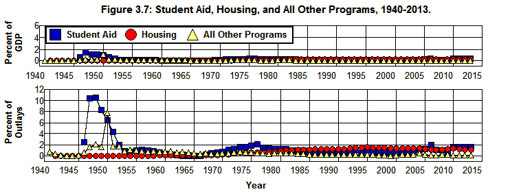
Of the nine programs left to be examined in OMB's Table 11.3, only two are of significant magnitude to be considered separately: Total, Assistance to students and Housing assistance. Expenditures on these two programs are plotted in Figure 3.7 as Student Aid and Housing, respectively. The remaining seven programs are included in All Other Programs in this figure.
Source: Office of Management and Budget. (11.3 3.2 10.1)
Student Aid increased dramatically following World War II as a result of the GI Bill, reaching an astonishing 10.3% of the budget and 1.49% of GDP in 1947. It then decreased sharply through 1953, then gradually until it began to increase again in 1965. From 1965 through 1976 it went from 0.04% of the budget and 0.01% of GDP to 2.12% of the budget and 0.44% of GDP. It declined sharply in the late 1970s and then gradually in the 1980s and 1990s to reach a low of 0.54% of the budget and 0.10% of GDP in 2001. Student Aid jumped to 1.95% of the budget and 0.38% of GDP by 2006 and stood at 1.68% of the budget and 0.35% of GDP in 2013.
At the same time, Housing assistance increased gradually from 1965 through 1995—from 0.19% of the budget and 0.03% of GDP to 1.69% of the budget and 0.34% of GDP. It then fell to 1.14% of the budget and 0.24% of GDP by 2013.
All Other Programs went from 0.60% of the budget in 1965 and 0.01% of GDP to 0.18% of the budget and 0.04% of GDP in 2013.
Yet again we find that these changes are substantially less than the corresponding 16.9 and 3.5 percentage point increases in Medicare, the 8.9 and the 2.5 percentage point increases in Social Security, and the 7.5 and 1.6 percentage point increases in Medicaid shown in Figure 3.2 and Figure 3.3.
Summary and Conclusions
Figure 3.8 provides a summary of the Human Resources programs contained in OMB's Table 11.3 where in this figure Total Outlays is the sum of all federal government expenditures as given by the OMB's Table 3.2, Payments for Individuals, Retirement, Medical, and Retirement + Medical are as given by the totals of the corresponding items in the OMB's Table 11.3, and All Other Payments for Individuals is the sum of all payments for individuals less expenditures for Medical and Retirement.
Source: Office of Management and Budget. (11.3 3.2 10.1)
This figure clearly shows the extent to which the dramatic increase in the Human Resources component of the federal budget has been dominated by the increase in Retirement + Medical since the early 1950s as Social Security began to grow and especially since 1965 when Medicare and Medicaid came into existence. Fully 84% of the 9.7 percentage point increase in Pay for Individuals as a percent of the economy from 1965 through 2013 can be attributed to the increase in Retirement + Medical, and only 16% of that increase can be attributed to all other payments for individuals combined.
When we break down the increase in Retirement + Medical over this period we find that 35% of the increase in Retirement + Medical from 1965 through 2007 came from the increase in Retirement, and 65% of the increase came from the increase in Medical. These numbers clearly indicate the extent to which the rising costs of medical programs present a challenge for the federal budget.
While Retirement increased dramatically from 1965 through 1974, it then stabilized as a percent of the budget and of GDP. As a result, in 2013 Retirement was at about the same level it was during the 1970s. This does not mean that federal retirement, specifically, Social Security, poses no problems. As was noted above, Social Security’s OASDI’S obligations are expected to increase relative to the economy as the baby boomers retire reaching a peak of 6% of GDP in 2036 at 1.2% of GDP above its 4.8% peak in 1983. This poses a problem, but this problem can be managed by the Social Security System without the need for a wholesale restructuring of the system. The same cannot be said for the problems faced by the federal healthcare system.
Unlike Retirement, Medical has increased almost continuously since 1975 from 1.63% of GDP to 5.59% in 2013. When we break down this increase we find that 67% of the increase in Medical came from the increase in Medicare and 30% came from the increase in Medicaid. The other 3% came from increase in all other healthcare programs combined. What is particularly disturbing about this increase is the increase after 1980 when the Medicare and Medicaid programs reached their maturity, and particularly in the 1990s. Federal healthcare costs have more than doubled relative to GDP since 1980. Clearly, it is the ability to control healthcare costs that poses the most serious challenge to our social-insurance system.
Finally, it is worth noting that All Other Payments for Individuals has remained a relatively stable 10% of the budget and 2% of GDP since the 1970s. It is in All Other Payments for Individuals that our non-medical welfare programs are to be found. Given the degree of misinformation that dominates today's debate over our welfare system, it is worth taking a detailed look at the nature of the programs that provide the foundation for this system.
Endnotes
[22] Those items in OMB's Table 11.3 that were less than $500 thousand in 2013 are included in the totals and subtotals in this table as well as in the graphs and numbers given below.
[23] It should be noted that programs that fall under the heading Federal employees retirement and insurance in Table 11.3 provide employee benefits comparable to the pension and disability benefits of private employers. They are a part of the federal government's employee compensation package just as comparable employee benefits are part a private firm's employee compensation package. The same is true of the medical programs for veterans that are included in Table 11.3. As a result, these items are generally considered to be employee compensation rather than social insurance, and the figures in Table 11.3 overstate federal expenditures on social insurance to the extent they include expenditures on employee compensation.
